HMC Health Management Consulting · Santo Domingo · 2026 · 3 months
A health consultancy’s whole website and brand.
HMC is a health consultancy that works with ministries of health across the Caribbean and Latin America. All they had was a logo and a two-page manual. In three months we went from that to a full website and visual identity, handed over ready for their team to write and publish.
Open the site →hmchealthconsult.com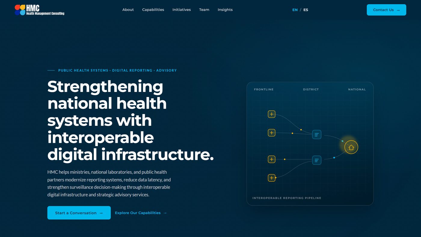
- What existed already
- A logo and a two-page manual with five colours and two typeface names.
- What I did
- I defined the brand language and the design system, designed and built the website, set up the CMS in English and Spanish, and handled the domain, corporate email, deployment, search visibility and the handover.
- What I did not do
- There was no team: no developer, no copywriter, no second designer.
- With whom
- Nobody else. I used AI tools as help.
- For whom
- HMC’s clients: ministries of health, national laboratories and disease-surveillance offices in the Caribbean and Latin America
HMC helps health systems get information from local clinics to the people making national decisions, without losing it on the way. A company that sells that can’t have a website it can’t even update itself.
So the website itself had to show that HMC can do what it promises.
There was no team, and one clear condition: at the end of the project, the client had to be able to write, publish and own everything on their own.
So the domain, the email and every account were in their name from the start.
Before designing anything, I worked out who the site talks to — ministries, national laboratories, donors, international organisations — and what each of them needs to see to trust HMC.
The brief was only half written, so this step turned it into a clear list of what the site needed.
Every section of the site, and its order, came from that list.
A logo manual gives you five colours and two typeface names. It doesn’t tell you how big headings are, how to use the colours, how much space to leave, or how the company sounds. I defined all of that and delivered it as a design system — a set of rules and ready-made pieces — so every new page stays consistent with the rest.
One of those rules: the logo’s typeface is used only in the logo.
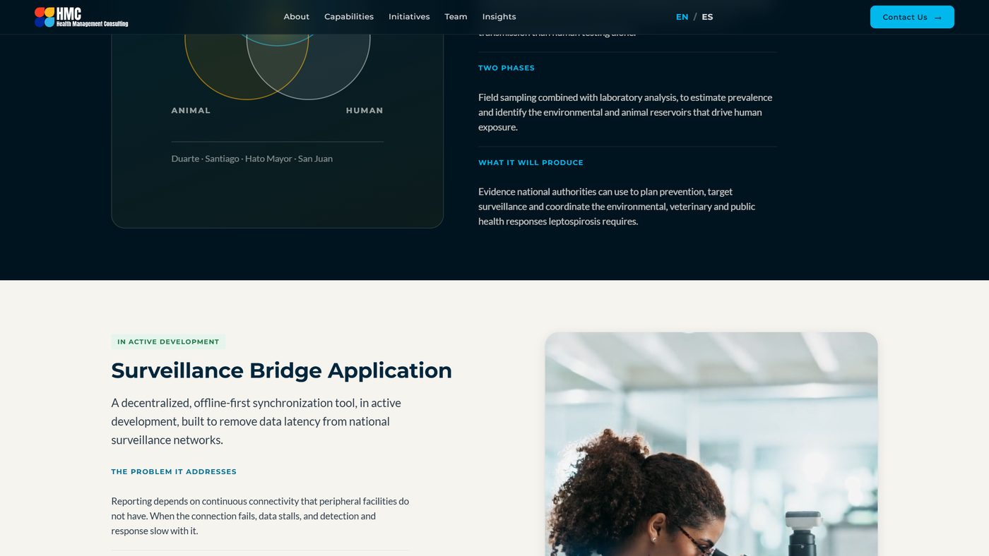
A one-page website you scroll through, in English and Spanish, with a CMS — an editor where the client writes and publishes on their own. Behind it: the domain, the company email and the code, all in HMC’s name from day one, plus hidden labels in the code so search engines and AI assistants describe the company correctly.
We closed the project with everything in HMC’s hands, ready for their team to keep going.
The project grew four times in three months, each time because we understood the client better, not because more was sold: the CMS on the first night, the accounts in their name, a team page with names and photos, and a section to keep publishing.
Then it went the other way: the page’s twelve sections are being cut down to ten, to make it shorter.
Shortening it doesn’t remove anything search engines rely on.
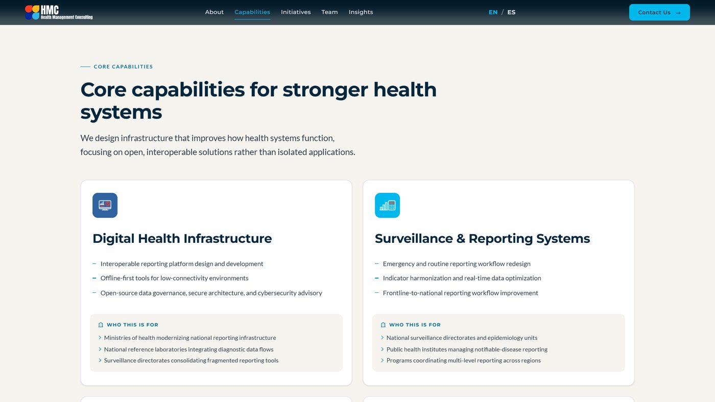
- Started as — a website with several pages and a CMS, so the client could publish their own content.
- Dropped — that multi-page version, on the first day, because one page you scroll through was easier to follow. In September, the first version of the services and projects sections too, because they were walls of text.
- Became — one scrolling page in two languages that the client edits, with its team named, a section to keep publishing, and a design system for whatever comes next.
- Kept — the handover rule: domain, email and accounts in their name from the start.
Concept, design, build and updates in three months, starting from just a logo.
- 4times the scope grew in three months, each one datedfrom the project record, 13 Jun to 12 Sep 2026 · not public
- 8kinds of hidden labels (structured data) that let search engines and AI assistants understand the sitesource · hmchealthconsult.com
- 2languages, English and Spanish, both written for the sitesource · the EN/ES switch on hmchealthconsult.com
It doesn’t show up on Google yet: the site is two weeks old. I will measure again in a month.
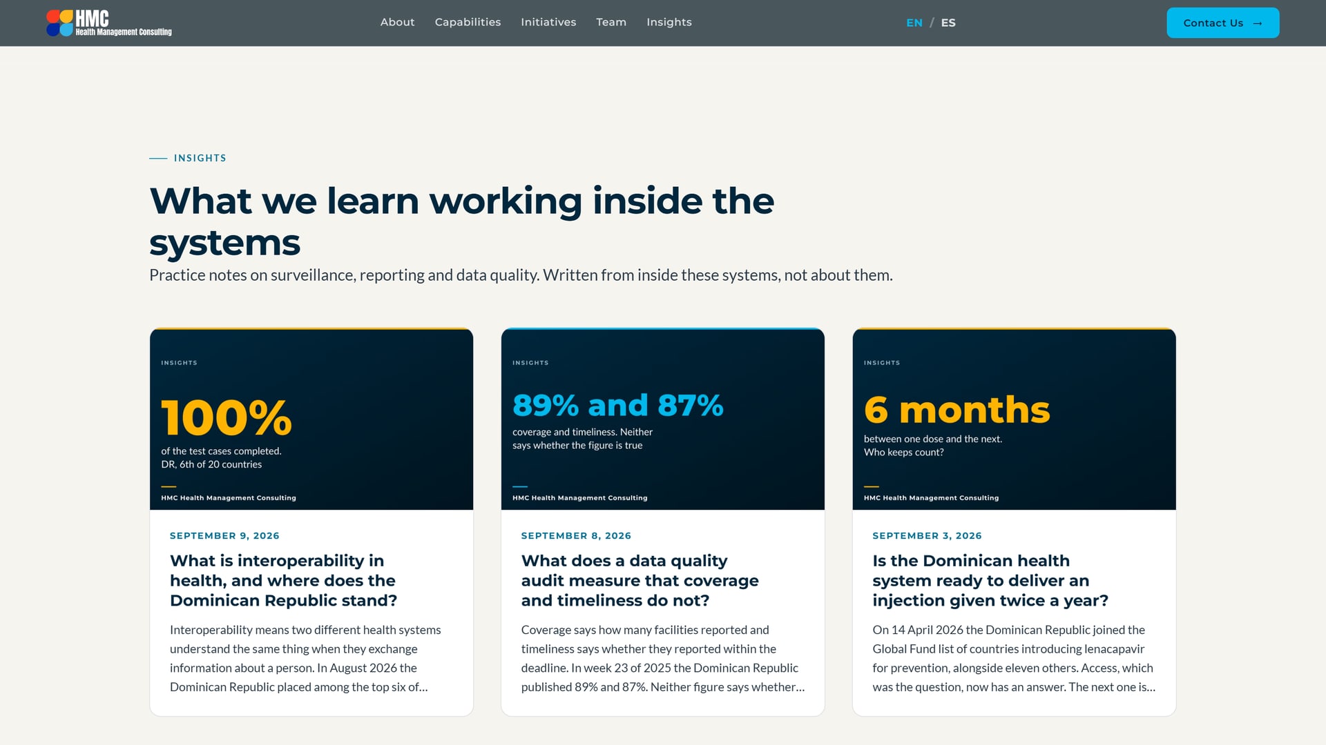
The page ends with Insights, a section where HMC publishes what it learns working with health systems. The first three articles went up in September, and HMC’s team keeps publishing new ones.
That is the real delivery: a site that keeps growing in their hands.
A project by Fran Bencosme · PortfolioA project by Fran Bencosme · Portfolio