LID & OGTIC · Dominican government · 2021–2022 · 2 months
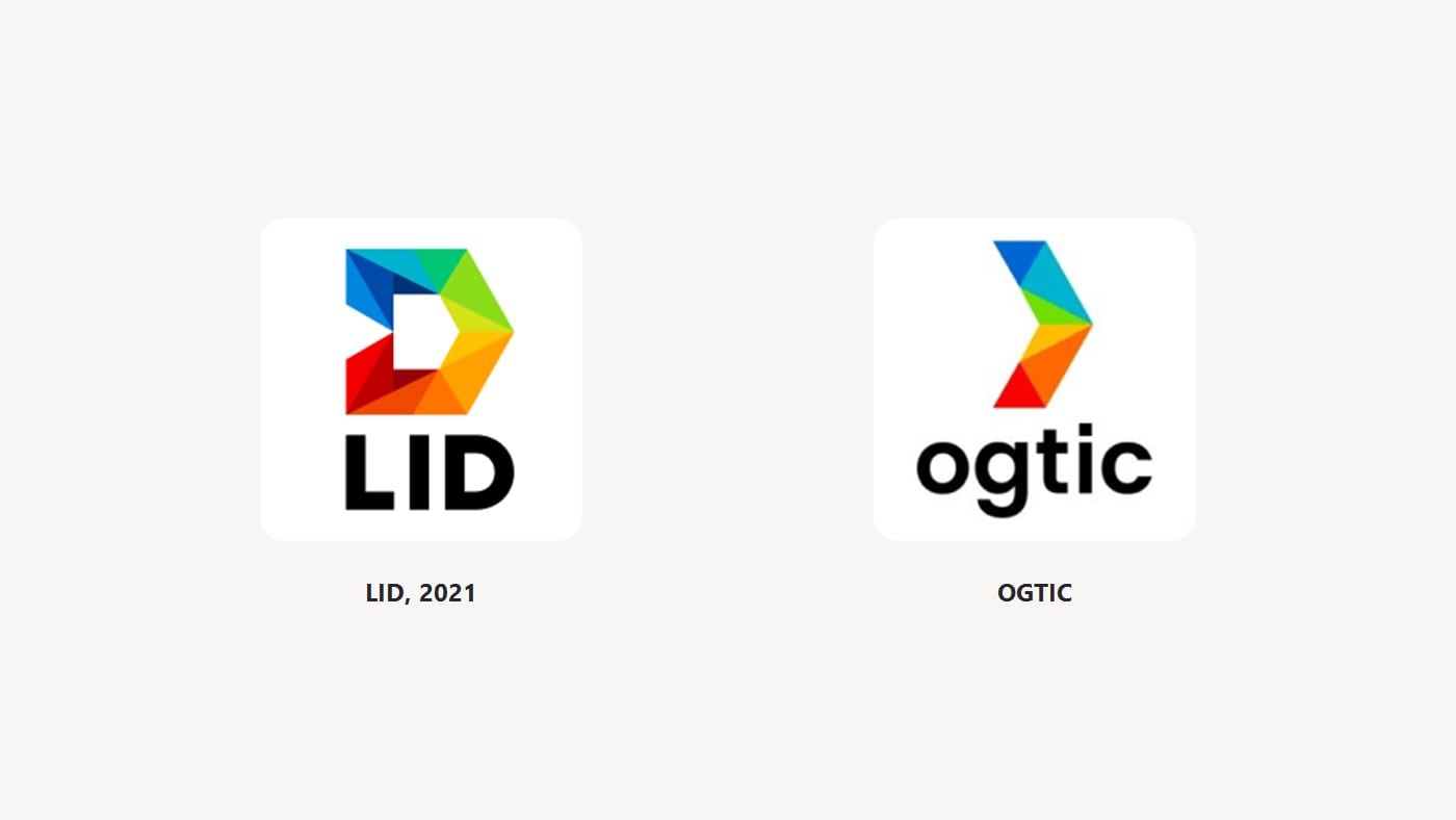
Logos for two government offices.
The Dominican government’s innovation lab (LID) had no brand. I designed one, from deciding what it should mean to drawing the logo. Later, when the government’s digital office became OGTIC, I co-designed its logo using the same shapes, so the office looks like the lab people already trusted.
- What I did
- The lab’s brand, from deciding what it should say to the final logo; its visual system; and co-designing the OGTIC logo
- What I did not do
- Rolling it out across government offices. Once the system was handed over, their team applied it.
- Time
- 2 months for the lab’s brand
- With whom
- The OPTIC team (the office that later became OGTIC)
- For whom
- The government’s innovation lab (Laboratorio de Innovación Digital), and OGTIC
A government office that asks citizens for ideas has a trust problem from day one. If it looks and sounds like a ministry, nobody brings it an idea.
Before drawing anything, we agreed on what the logo had to say: curious, human, moving forward.
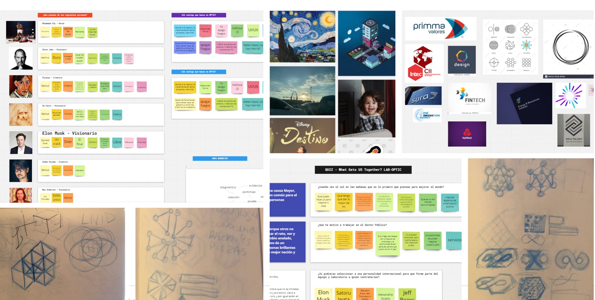
A government brand gets used everywhere, often by people who are not designers. The logo had to work flat, on any colour, in a single ink, and shrunk down to a browser-tab icon. We had two months.
That tiny browser icon is where most government logos fall apart.
- Started as — a logo made of facets, leaning forward, in colours that don’t look like a government office.
- Dropped — the ministry look. A brand for young people improving the government from inside had to lose the official seal and the old-fashioned serif type first.
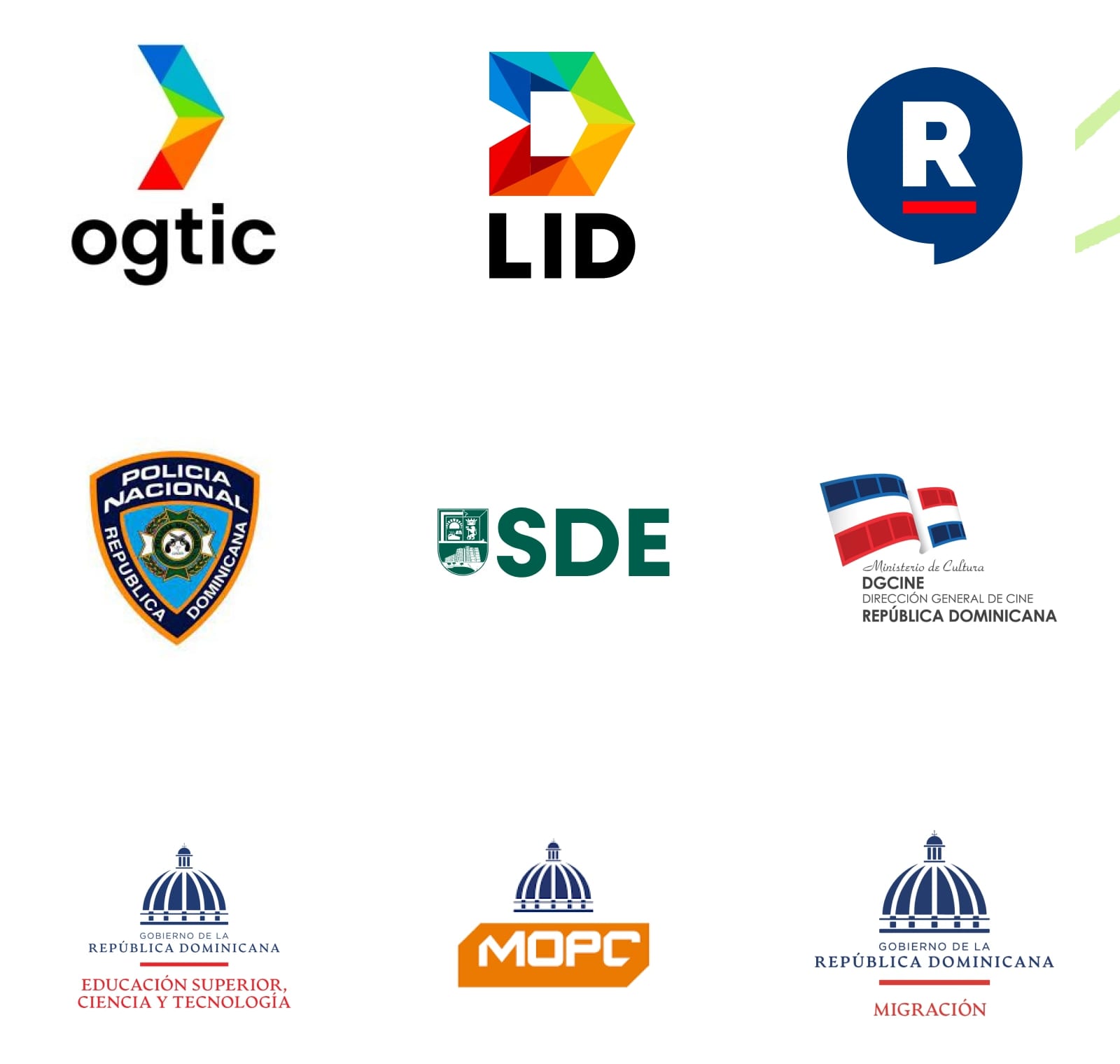
- Became — the base for the bigger office’s logo: when OPTIC became OGTIC, its new logo reused the same facets and arrow.
- Kept — the OGTIC logo. It is still the one the office uses today, on its website.
- 3×citizens at the lab’s events after the relaunchas the lab recorded after the relaunch
- 2×government institutions bringing projects to the labsame record; proposals also arrived clearer and better prepared
- in usethe OGTIC logo, still used todaycheck it yourself: ogtic.gob.do
A project by Fran Bencosme · PortfolioA project by Fran Bencosme · Portfolio